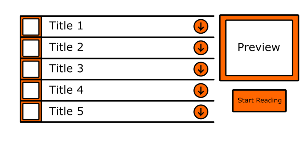
Layering and separation is common place on a website and if done poorly users will struggle greatly to navigate it. Therefore great care must be taken in order to create an easily navigable webpage. Below is a section of the Last Page’s website in which readers can pick out different chapters of a comic to read. Each element is given its own space to avoid mis clicks by the user, they are also big enough for the same purpose. In order to make this easy for the reader all the chapters are displayed one after another on one side of the screen, the titles of each chapter are given as this is the most important information for the readers to see first. This is a example of grouping familiars which Tufte explained as one method of achieving good layering. After deciding a chapter the reader can then click on the chapter and they will be given a preview, in other words more information. The goal with this design is to not clutter the screen with an excess of information and instead use layering and separation to allow the user to only see important information and delve further of their on volition.