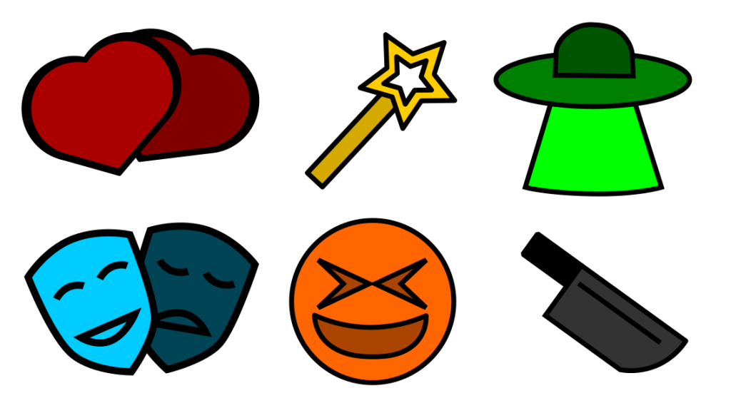
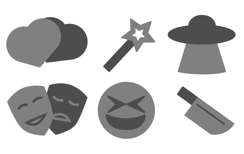
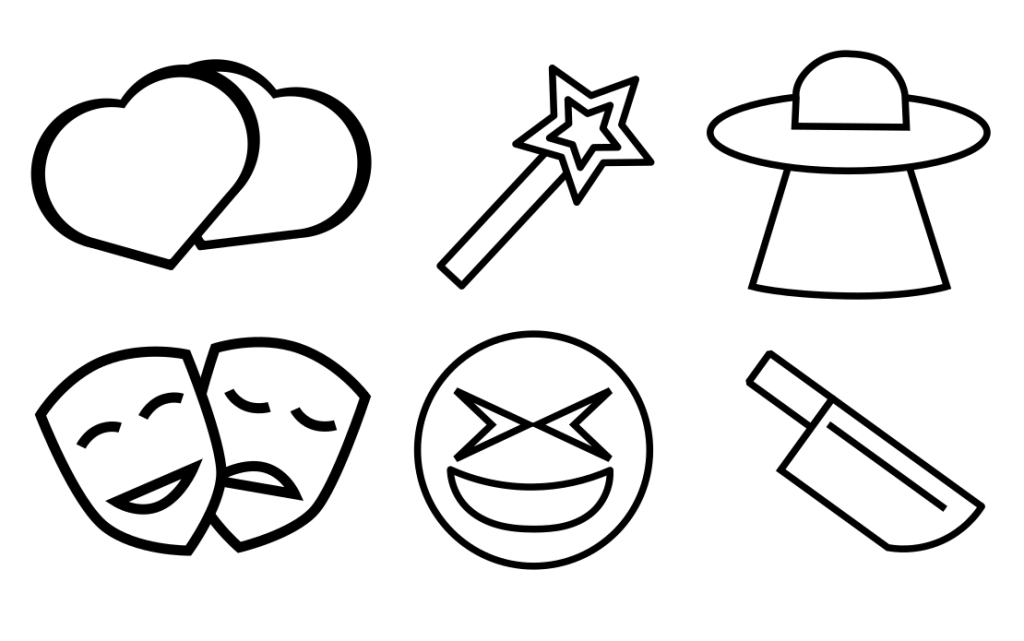
The icons below are used to visually describe the different genres offered by the website. In order to do this the icons must differentiate themselves from one another using different shapes and colour. In the first example by each icon having a different colour it is made easy to tell the difference of each icon with a glance, but more importantly by having a distinct colour if the colour was to be repeated that repetition would then be linked back to that colours theme/genre. The later two examples, although lacking colour, can still be differentiated due to the difference in shape. These examples could be used in situations where adding too much colour to a page would take away from its focus. Keeping the icons to the same shades of black and white make sure they don’t stand out too much but still let the reader tell them apart due to the shapes.