
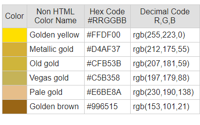
The first thing to do was decided what colour/colours I would use. I came to the decision that I would use a gold like colour as it would well represent the theme of gods and higher beings. I used this website, https://www.rapidtables.com/web/color/Gold_Color.html, and tested out the different colours to see which looked best with my design. In the end I went with ‘Golden yellow’ as the others felt to cold and dark.
Once I had the colour I would the need to implement it into my design. I while testing the colours I used my original design.
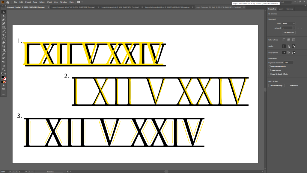
With the first design I duplicated the design and layered them to create a shadow affect. I then changed the colour to Golden yellow. I like this design as the shadow affect gives a sense of vastness and by extension grandness.
In the second design I used the different segments of the numerals and coloured them in different shades. This creates a similar sense of depth as the first design however can also be seen as indented which correlates with the inspiration of this design and font which is the Trajan Column where text was etched into stone.
I kept the third design simple to contrast the previous two. On top of the original design I added lines tracing the text which were coloured in place of the text.
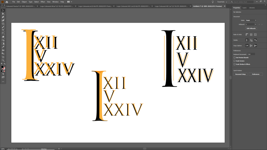
I also tested the variations on an alternate design that I considered using.
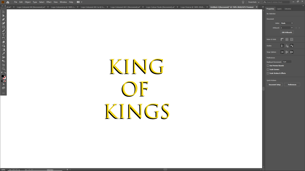
In the end I decided to merge both the first and second designs incorporating both the shadow effect and the different shades to create the designs above. I also decided to change the name to ‘King of Kings’, this name represents the theme of gods and mythology of the past. Above is the final product.