
To start with I gathered all of my influences and interests into a group in order to pick out a theme, some of them included: Space, Video Games, Music, Mythology, etc. I then started by looking at my name and thinking of what I could do with it.
At first I thought of using the space in between my first and second name and filling it with a symbol of some kind. I experimented with this idea however I am yet to produce any results I am fond of. Next I thought about how I could change the letters of my name to alter their appearance. Eventually I came up with the idea of replacing the letters of my name with roman numerals corresponding to the number of the letter in the alphabet. At first I did my full name however that came out too long so I went with only my first name.
Once I had the letters I then had to decide on a font. I researched different fonts and found that the best font to use would be Trajan as it is derived from the Trajan Column in Rome, a piece of roman architecture completed in AD 113.
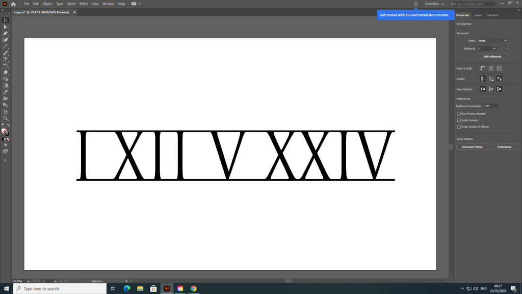
The screenshot above was the result. Once I had this basic design finalised I could then start experimenting with different options using this design as a base. To change this original design I broke up the numerals into individuals and tried different combinations, while still keeping the same order.
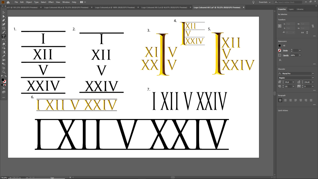
In total I created seven alternatives to the original design, shown above. My two favourite out of these being no.3 and no.5. In both of these designs I took the first numeral I and enlarged it to make it the focus on the design.
In the consequent task I decided to use my original design as I didn’t completely decide on a new one, however due to the nature of the designs it would not be difficult to bring the changes into the alternate designs as they share the same font and text.